|
By Ryan Tibbens for educational purposes only
(Updated 4/28/2020 -- Scroll to the bottom of the article for some GREAT visual demonstrations from other sources.)
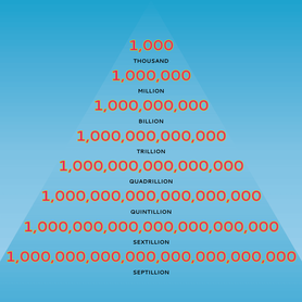
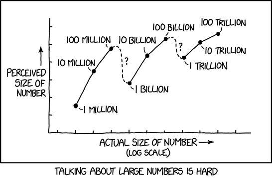
I just saw a time conversion that, when I think about it in dollar figures, is absolutely mind blowing. Here goes... - 1 million seconds equal 11 and 1/2 days. - 1 billion seconds equal 31 and 3/4 years. - 1 trillion seconds equal 31,710 years. That means if you have one billion dollars in the bank, you can spend a DOLLAR PER SECOND, every second, or $3,600 per hour, and not run out of money for nearly 32 years; and because of the interest you'll be accruing, it will actually be substantially longer than that. Now, let's think about wealthy people in the news. Robert Kraft, owner of the New England Patriots and patron of strip-mall whorehouses everywhere, is worth $6,600,000,000 (billion). If he converted all investments to cash, he could spend one dollar per second, every second for over 209 years, even without earning any capital gains. And, get this, he is only the 79th richest person in the United States. Jeff Bezos is the wealthiest person in the USA, with a net worth of over $160,000,000,000 (billion). That means he could spend a dollar per second, every second, or $3,600 per hour, for over 5,074 years. If we could travel through time (and given his wealth, he probably can), Jeff Bezos could start spending one dollar per second, every second at the beginning of the Bronze Age, and he'd just now be running out of money. The US national debt is currently about $21,974,000,000,000 (trillion), which means we would need to pay one dollar per second, every second, or $3,600 per hour, for 696,791 years to be debt free nationally. The average American household carries something like $140,000 of debt, which means that someone in that house would need to make and spend one dollar per second, every second for almost two days just to be even, just to be out of debt. Something is wrong. Data Visualization from outside sources
Since writing and posting this article a little over a year ago, I have encountered some great websites, videos, and posts that try to make the same point I did above -- big numbers are not at all what most people think they are. Before expressing opinions on issues that include big numbers -- government spending, economic inequality, personal finance, space travel, or anything else -- PLEASE review the sources below. WARNING: Link #2 might be the most startling and interesting, but because of this website's' formatting, it looks the least appealing. Definitely check out #2. Also remember that data changes all the time, so if you want to reference these sources, it is important to include production dates and context.
1) This 1-minute video uses grains of rice to compare hundreds of thousands to millions to billions.
2) This website offers a scrolling demonstration that includes commentary and explanations. Click the link, start scrolling right, read as you go, and keep scrolling right. Then scroll right some more. Seriously, this will blow your mind. https://mkorostoff.github.io/1-pixel-wealth/ 3) This is an oldie-but-goody. It is from late 2012, so the exact statistics are now inaccurate. Unfortunately, the numbers in 2020 are even more uneven and startling. For those who want to put wealth figures into more understandable terms like percentiles, this is a good visualization. (Just remember that the data is old.) 4) This demonstration compares the wealth of some of the leading Democratic candidates for president in 2019/2020. The candidates' names and politics are, for the purposes of the current discussion, less important than the visual comparison of wealth. CREDIT TO http://rossblocher.com/hosted/candidatewealth.html; check out his great work! Keep scrolling down!
1 Comment
|
Read.Think.Write.Speak.Because no one else Archives
December 2021
Categories
All
|


 RSS Feed